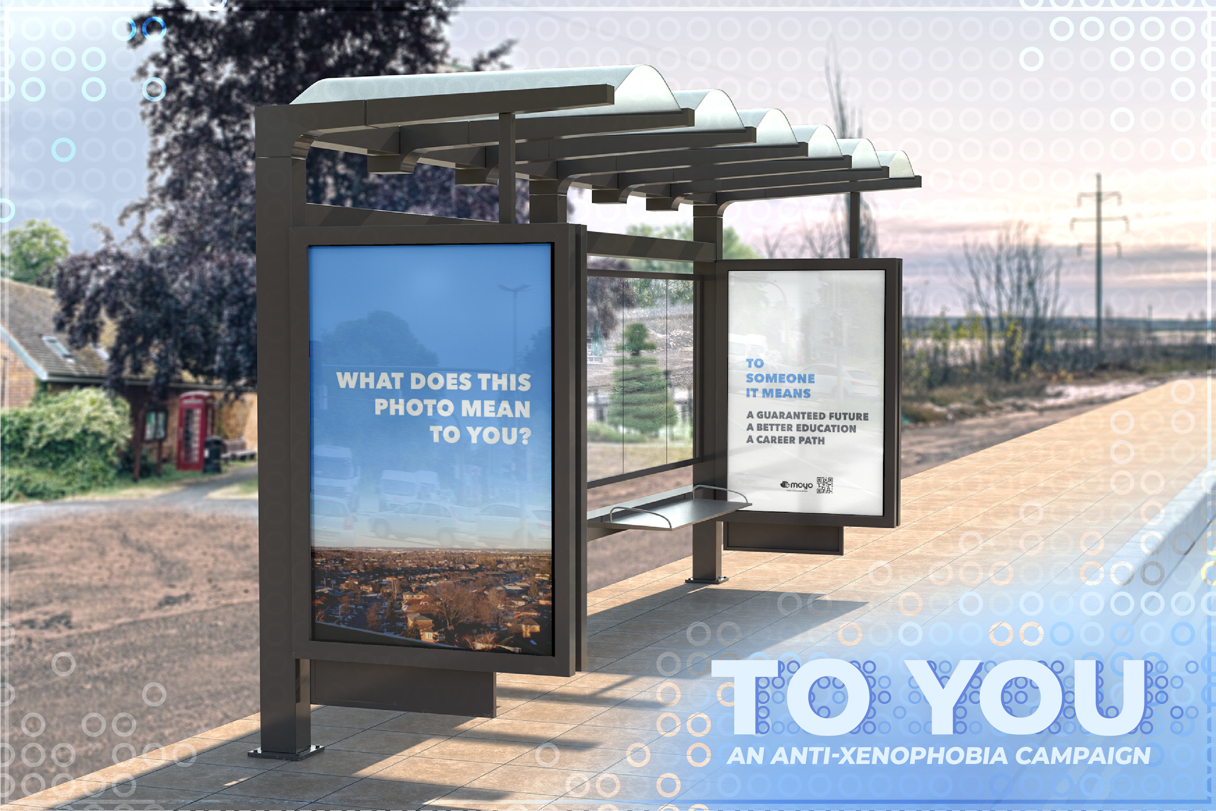
TO YOU Campaign
An anti-xenophobia campaign that aims to stimulate curiosity and centre newcomers’ stories through their own photography.
Na
vi
ga
tion
.
.
Design for Health: Health Context 2 (OCADu)
TEAM
graphics, mock-ups, research, report writing
ROLE
photoshop, illustrator, indesign
tools
Challenge
Anti-xenophobia campaigns designed without proper care and consideration of the target audience can backfire, further isolating newcomers.
The client, a local health and community services centre, approached us with a Photovoice project by some of their newcomer members. They hoped we could help set up a digital art exhibition of the photovoice project work that tied into an anti-xenophobia campaign.
Photovoice is a qualitative research method employed as a means of creative expression. It’s a form of Participatory Action Research which brings participants from a marginalized community together in group dialogue, by using photography as an expression of self and/or story.
SOLUTION
An anti-xenophobia campaign based on the photovoice project participants’ unique personal experiences as immigrants, as communicated through their original photography. The campaign is about unity in individuality and commonality in uniqueness.
Using the photovoice photography and narrative, the campaign shares the newcomers’ meanings behind their photography, but also wants to engage the viewer, asking “What does this mean to you?”
The campaign’s goal is to provoke openminded consideration of the barriers to social inclusion for newcomers, and the contextual nature of meaning.
POSTER DESIGN
CATEGORIES OF ACTION
Public Presence
Physical space
Community publishing and broadcasting
Community events and festivals
Central Info & Edu Hub
Community centre website
Website Resources
People Awareness
T-Shirt Campaign
Postcards
Word of mouth
Digital Activation
Word of keyboard
Hashtags
speculative design component
We were asked to develop a speculative design angle of this campaign, through which we can imagine a grander scale and even deeper meaning to the central message.
For this portion of the project, the geographic scope expands to other locales, and the scale of installations ramps up. Notable spaces and buildings, or places of large gathering are the optimal spots to host the speculative campaign, using large-venue projectors, billboards, and other large-scale ad spaces.
A larger presence would exponentially increase digital engagement, as viewers would take to Google or social media sites to investigate what this message is about.
Though completely financially unachievable, to have the message straddle a national border would be particularly poignant.
process
The literature review was vital to this campaign, as it reinforced that this project required a lot of care in a tender balance of critical design without heavy-handed critique. We chose a message that felt open and non-judgemental, but was still thought- and curiosity-provoking. The goal is for viewers to keep open minds as they consider the barriers to social inclusion, leading them to critical design thinking on their own.
LITERATURE REVIEW
Literature review included
anti-discrimination interventions
global equity campaigns
causes and motivations of xenophobia and racism
cognitive biases pertaining to prejudice
cognitive biases & backfire effects
A lot of our caution is due to the Backfire effect, a type of cognitive bias where an individual, when presented with information to correct mis- or disinformation, increases their belief in their original misconception. Backfire effects occur most commonly when either the method of presentation or the information itself challenges an individual’s sense of self.
Backfire effects are a significant danger for anti-discrimination messaging. So, in addition to understanding who this campaign would represent, it was also essential to understand all potential audiences.
TRANSLATING Photovoice
to campaign
As a community centre project, the selection of photovoice images provided to us was limited, and since the campaign would revolve around the photos we got and their captions, this greatly influenced the development of the central campaign message.
To select photo/caption combos to use for the campaign, the identified inclusion criteria are:
Strong composition
Impactful quote that can be pulled from photo’s accompanying blurb
Informed consent from artist/participant
Exclusion criteria was mostly concerned with avoiding harm:
Visible brand logo or identification
Narratives that could induce backfire effect in viewers
REFLECTIONS
By working with the limitations imposed by a smaller amount of source material, rather than struggling against it, we were able to think reflexively and even metaphysically about Photovoice. With a greater field of play, we would never have come up with the What does this mean to you? tagline.
I’ve worked in the opposite conditions as well, where there’s too much option, and I’ve come to see those situations not as restrictions, but as tools. You can either work with what you have, or you can stress about what you don’t.


![[ORIGINAL IMAGE CREDIT] Garden Square by unknown author at Bramptonist https://bramptonist.com/huge-street-party-happening-brampton-month/](https://images.squarespace-cdn.com/content/v1/6410e6bb39645b70700d081e/c4f3d7c7-3d80-4223-a098-899d989b7e86/To+You+campaign-08.png)
![[ORIGINAL IMAGE CREDIT] Celebration Square by unknown author at Mississauga.ca https://www.mississauga.ca/arts-and-culture/locations/celebration-square/venue-info/](https://images.squarespace-cdn.com/content/v1/6410e6bb39645b70700d081e/805d7a5a-41b3-462e-bbe5-7b98958dda5a/To+You+campaign-09.png)
![[ORIGINAL IMAGE CREDIT] YDSQ by Branded Cities brandedcities.com/2019/76380/](https://images.squarespace-cdn.com/content/v1/6410e6bb39645b70700d081e/2476c126-d9df-473e-9587-6142c2747b1d/To+You+campaign-11.png)
![[ORIGINAL IMAGE CREDIT] Mississauga Monroe Towers by Harold Stiver https://www.shutterstock.com/video/clip-10967996-mississauga-ontario-canada--july-272015-4k-ultrahd](https://images.squarespace-cdn.com/content/v1/6410e6bb39645b70700d081e/57a0ee72-fd96-4be6-bb04-865e96ea32b3/To+You+campaign-07.png)
![[ORIGINAL IMAGE CREDIT] CN Tower on the Blue Sky by Paulo Barcellos Jr. https://www.flickr.com/photos/paulobar/1272956921](https://images.squarespace-cdn.com/content/v1/6410e6bb39645b70700d081e/5d71eea1-bd45-489f-9de3-2a654c4a1ba4/To+You+campaign-12.png)
![[ORIGINAL IMAGE CREDIT] Niagara Falls by Romy Lee https://romyleephotography.com/](https://images.squarespace-cdn.com/content/v1/6410e6bb39645b70700d081e/b40e91a2-5b39-41b7-8756-b3b34af1ae1b/To+You+campaign-10.png)
